Thursday, December 8, 2011

Visual Techniques


Contrast Harmony
Balance Instability
Simplicity Complexity
Activeness Stasis
Subtlety Boldness
Consistency Variation


Contrast Harmony
Balance Instability
Economy Intricacy
Subtlety Boldness

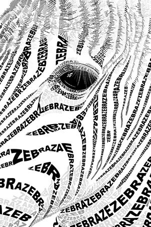
These two images are examples of what i believe to be excellent typographical designs. They are also both pretty different from each other. They are both very contrast oriented designs. This makes them stand out from a lot of typography, because it will catch the eye easily. Both use contrast and harmony in their visual techniques. They're very harmonic and simplistic in their concepts, but contrast is used as an agent to make the designs pop out. The zebra design is much more intricate than the futura design, while the futura is more bold. This visual technique gives the title type of the futura book a much more solid impact, while the zebra design doesn't require the viewer to read every single piece of type.

Thursday, December 1, 2011

Blog Exercise - CONTRAST


This is an example of excellent use of contrast in a design. There is no ambiguity or confusion to be seen. The typeface always contrasts sharply with the background color so everything is easy to read. There is contrast in tones of the two red colors, bringing a little more interest into the design. There is also contrast in the size of the typefaces which adds variety to the design. The two main stripes overlapping in the design are contrasting with each other, which gives the design balance. contrasting the bolder typefaces with the lighter thin typefaces helps distinguish between different sections of the design. Pretty much every aspect of this design contrasts with the other aspects, which makes this design clearly "pop" and makes it easily readable


This is an example of a design with hardly any contrast. As a result, the image is not very readable. The eye has no idea where to start, or how it should browse the image. There are no contrasts of depth, and the image feels completely flat. The buttons for the website have no contrast with their background, so it is difficult to understand that they are links. The design is supposed to represent a pop-up book, however without any contrast in depth, the design seems too flat. The colors are all very desaturated, and on a white background they do not add any interest. The row of buttons on the bottom of the screen have very low contrast as well, making it difficult to notice they are there, and harder to navigate the webpage. With added contrast, this webpage could be a lot easier to navigate, but as it stands now it is a horrible design.

Thursday, November 17, 2011

Week 12: Movement and Motion


This Nissan advertisement has implied motion. It is implied that the 350z in the ad is supposed to be speeding off screen towards the edge of the paper. The way the designer implied this motion is through the blurring of the wheel spokes. The designer also shows motion in the implied movement of the camera backwards to try and stay in view of the vehicle. The black squares in the image are flying out of our view, like the camera is panning. This motion is specifically well designed for an automobile advertisement, because cars are always in motion. The ad was designed to look like a snapshot of the Z in a fantastical fantasy world of black squares and strange patterns. Someone hoping to buy a new car might be attracted to this ad because it shows the vehicle racing through a videogame-like world.


In this graphic there is implied motion of the user's hands. He is supposed to be manipulating the informational cube in front of him. Small arrows and design marks on the cube itself show that the edges of the cube can be manipulated. The hands themselves seem to be grabbing the edge in order to move the corners into a new shape. The mans awkward hand gestures let you know that the photo was meant to be a snapshot of the man changing the shape of this cube, and not just a normal stance. The motions the man is making are indicative of him being able to fine tune his selections and adjustments. Whatever this advertisement is a design for is meant to be able to have hands on manipulation and the ability to change the perspective of what you're working on.

Thursday, November 3, 2011

10: Tone and Color


Tone is operating in the blue wave shape. It helps to give the wave a three dimensional quality, which pops it out from the rest of the design. Without the tonal gradient, the wave would look flat on the page, but instead looks like its curving over.

Tone operates in conjunction with direction in this case. The tone makes the blue design seem like it is thrusting up from the bottom of the page, and is about to crash onto the type. Tone changes the direction in this case from that of a circular motion, to that of a wave motion. If there were no tone, direction would be seen as a circular motion following the lines of the blue area.

Color also operates in the blue wave shape. Without the blue color of the wave, the design would be lacking an eye catching quality. The blue wave is the first thing people will look at when they view this image. The blue color is the only color in the whole design other than the grey scale airplane wing and type.

Color interacts with line and shape. The lines incorporated in the wave, and the shape which is formed, circles around the central axis which in this case is the type. Color is catching the attention of the viewer, and line and shape help to shift the viewers eye straight to the text for consumption.

Thursday, October 13, 2011

Blog Exercise - Visual Perception 2 / Feature Hierarchy


This info-graphic manages its visual feature hierarchy in a way that makes it easy to understand what is being displayed. The viewers eyes are immediately drawn to the large circles above the map. This contrast in shape is the most eye-grabbing visual on the page. This is a positive thing, because the information in the circles in the main topic of the info-graphic. The eye is most likely going to move to the bottom two rectangles of information below the circles. The rectangle to the right is where the eye move next, because of the contrasting large numbers and bold typeface. The eyes tend to see color as the highest feature in the visual hierarchy, then size, then shape. There are very few visual feature channels seen present in this graphic as compared to some others, mainly because it is a static piece. The objects have strong spatial grouping, which also aids in making the visualization easy to understand.

Thursday, October 6, 2011

Blog Exercise: Visual Perception 1 / Top-Down Visual Processing


This advertisement is an example of top-down visual processing. It has goal-directed eye movements built in. Your eye is directed along the swirling lines towards the text on the left. The eye is given short fixations on the swirling lines, which eventually come to focus on the skier, which is a longer fixation. The viewer then shifts over to the text, reads that, and realizes the advertisement is for Nike. The viewer then makes the connection between Nike and Skiing and sports.

Nike Advertisment, found @ http://ffffound.com/image/bcac3fa33b56931952379d3adf3e72f5a030c9b8

Thursday, September 29, 2011

Week 5 Blog Exercise - Design Success and Failure in Relation to Syntactical Guidelines

In this great design, there are many examples of the use of the syntactical guidelines. The table of contents seen above was designed in a way so that the viewer could easily identify which chapters would be located on which page. It was designed to be quickly read and easily understandable. One of the most striking things about this design is the strong use of positive-negative colors, which easily groups the page numbers with their chapters. The text box in the upper left corner has a sharpening effect on the whole image, since the text and page numbers are imbalanced on the rest of the two pages. The image succeeds because the design is simple and straight to the point. When someone is turning the book to the table of contents, they want to find the page they're looking for as soon as possible, and I think this design is suited well for that task.


This design, on the other hand, is not as effective with its use of the guidelines. There is an overabundance of stress on the page. While balance is present, it is not easily readable. There are larger icons spread around the page which are not labeled and are not recognizable as to their function. The buttons are not grouped in a way that is easy to use and intuitive. The colors are not interesting, and while they give a sense of friendliness for children, their contrast is either not enough, or too much.

Thursday, September 22, 2011

Blog Exercise 4: Visual vs. Symbolic Language


--reports a very dark message
--ominous figure looming in the background
--very old looking
--hiding something
--behind closed doors
--silhouette unidentifiable figure, could be anyone
--looking through a door into a place you don't want to to
--framed compositionaly
--labeling of door suggests simplistic design
--English words present

The image is a square, framed in on the clouded and foggy-looking window of an unemployment office. As seen through the window, there is a figure of what looks to be a young male, facing the door and waiting for you to enter. Across the center of the window, the words "Unemployment Office" have been placed in order to confirm your location. The letters are suggestive of an older era, and seem to be a clear brown plastic in a sans-serif typeface.

Thursday, September 15, 2011

Week 2!


Representational
--The representational part of this image is the leaf-like texture located inside the running legs. It is an instantly recognizable representation of a leaf and its vascular structure.
--Since the image is representing a cardiovascular association, the vascular veins in the leaf are representing respiration and blood flow within the pair of legs it has been placed.
--It relates to the other two levels because it is simply a representation of leaf structure, but its placement has been purposefully chosen to make the viewer make the connection between the green plant structure and the human body in reference to the cardiovascular system.

Abstraction
--The legs in this image represent the abstraction. They have been dwindled down to the most basic structure that could be identified as legs. Their role is to make the connection so that the viewer knows it is a human body part.
--Without this abstraction of legs, the viewer would not be able to see that the image is concerning the human body and its parts.
--The abstraction is not only of a pair of legs, but a pair of running legs. This further reinforces the idea of cardiovascular health.

Symbolism
--The words on the page are considered symbols. Without these particular letters which represent meaning in our culture, it would be much more difficult to understand what is going on.
--In this image, the viewer will most likely look to the pair of legs, think about them for a second without fully understanding it, and then look to the words for explanation.
--Without these words on the page, the reader would most likely be confused as to the purpose of this advertisement. They clarify the image and also provide the reader with more information as to what the image is trying to propose.